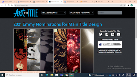
Art of the title This website specializes is movie title sequences. the homepage of the website first shows a collection of Emmy nominations for main title design. The homepage also has two drop down bars at the top of the screen. When you click these drop down bars your able to uncover the different categories of movie sequences opening. There categorized by genre, off to the side there is a section that has a link that leads to all of the opening sequences on the website. When you click on a movie sequence your first shown to the sequence itself, but when you scroll down you discover a general description of what the movie or show is about. A rundown of the sequences follows afterwards. The rundown discusses schematics, the production team, and how it relates to the plot of whatever piece of film the opening belongs to. Me and Macaria would be using this website to research the different opening sequences for the different genres so that we can get a better understanding of the...
This was our second day of filming. The second day of filming was significantly more difficult than the first. One of our group members who played a main part in acting in the commercial was absent. My other group member and i had to figure out an alternative way to successfully film a commercial. I ended up following the story board but made it an independent act. After brainstorming and using teamwork, my team member and i were able to come up with a plan that will make sure we complete the commercial. Just in case Loudui was absent on Thursday, our last day to film, we had completed filming a commercial with just myself as an actor. If Loudui showed up on Thursday, we could complete the scenes including her that we started on the first day of filming. My other group member and i filmed a complete commercial but we waited to edit everything just incase we got the chance to finish filming the original commercial with Loudui. Kiara and i don't know each other too well so this gave...
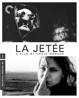
Chris Marker's 1962 short film "La Jetée" was modified by Terry Gilliam in 1995 to become the feature-length blockbuster "12 Monkeys." Instead of calling his own dystopian narrative a movie, Marker called it a photo book. The film consists of a number of still photos with voiceovers. It has a detached narrator who seems unconcerned with the current situation, which lends a more remote air to a tale about nostalgia for the past . Similar to La Jetée, 12 Monkeys was created by fans of the film and is a purposeful, reverent reworking of Marker's original plot, themes, and concepts. La Jetée is a fascinating low-fi sci-fi time-travel story told in these vignettes, in which a Parisian World War 3 survivor is transported back in time to save mankind before the earth was radioactively destroyed. This editing was exceptional because of its high-concept, action-focused nature. The nameless man in 12 Moneys is chosen because of how tightly he holds onto a pict...


Comments
Post a Comment